6 Years of Imprint! Impress! Luc makes a monolithic protest using foiling against the onslaught of plastic

bb Luc square

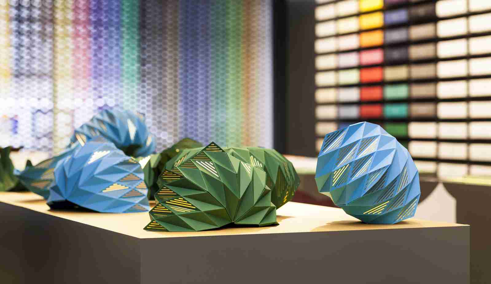
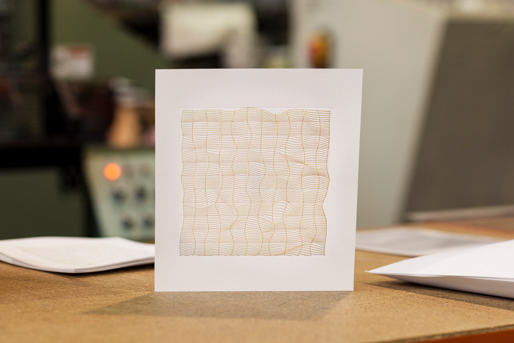
A design student has made a bold statement against plastics with an artwork made from foiling paper, while exploring the opportunities and artistic beauty of foil blocking. Luc Crossley was this year’s candidate for the Imprint Impress project undertaken every year in a collaboration between Ravensbourne University, Baddeley Brothers, GF Smith and Foilco. Luc is … Read more

Baddeley Brothers take Ravensbourne graphic design student ‘into the fold’ for foiled envelope collaboration

bb nelly 8129

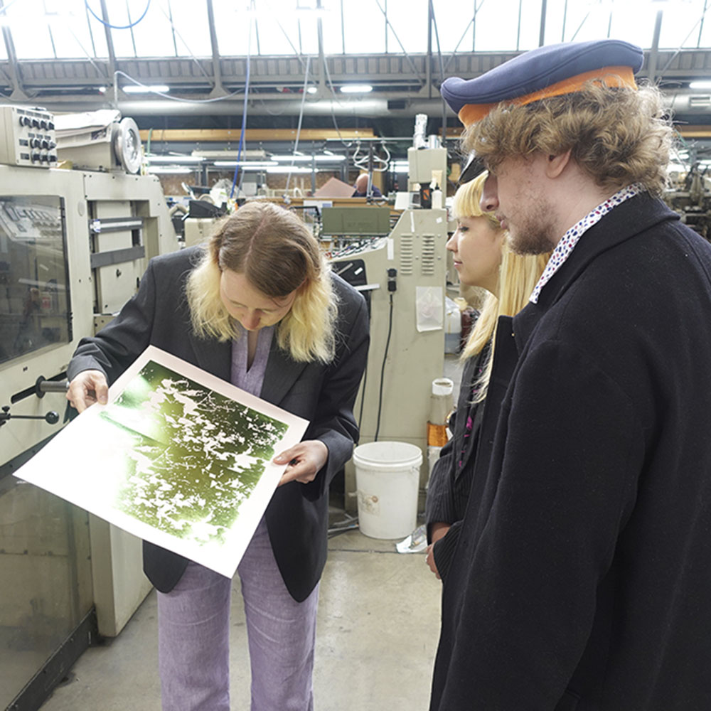
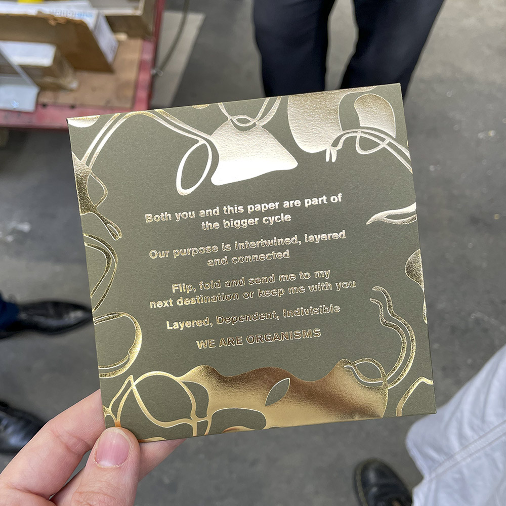
An ‘eye-opener’. That’s how a 22-year graphic design student described her experience working with Baddeley Brothers in May, after winning this year’s im-print! im-press! in collaboration with GF Smith and Foilco for her foiled envelope design. Nhelete Dos Santos came to the UK from Mozambique two years ago to study at Ravensbourne University. This means … Read more

Stationers’ Warrant awarded for ‘flawless design’ in producing die-stamped rum label for No.13

Stationers 2021 Warrant Crest

Innovation and flawless design have won Baddeley Brothers the coveted Stationers’ Company Warrant for its work on labels for the rum brand, Pirate’s Grog. It follows the scrutiny of the die-stamped label by the judging panel and they commented: “Traditional, elegant and distinctive were some of the descriptions the judging panel used to describe the … Read more

Historic wood type font inspires new brand identity for East London Brewing Company

rsz img 1132 e1575384239482
Compliment slips and business cards using inspired by wood type font

A Decade of Brewing

After nearly a decade of brewing high quality, popular British beers, the husband and wife dream team behind the East London Brewing Company are evolving their brand to stand out in an increasingly competitive national and international market.

Webp.net resizeimage 6
On the press

Founders Claire Ashbridge-Thomlinson and Stu Lascelles asked designer Clare Skeats to refresh their ELB logo, retaining its roundel device and building on the brand’s East London roots. Her journey through East London began at an artist-run, open access studio.

Clare explained: “East London is known for its industrial past, which resonates today in the form of the many makers and artists who are based here – some of whom are reviving traditional crafts and skills. This also connects to what East London Brewing Co themselves are doing within the craft of brewing. I decided to work with Simon Goode at the London Centre for Book Arts, in Hackney Wick, which was once the heart of London’s print industry.

I had the idea to reference the typographic language of East London’s industrial heritage; the robust grotesques that were commonly found around the docks and railways in the 1800s. Luckily, amongst LCBA’s collection of wood type, I found the perfect letter forms, which Simon and I letterpress-printed to form the basis of the logo.

Technological Challenges – The Physical into The Digital

“Translating a physical piece of print into workable digital files was quite challenging as I needed to create a large suite of files for various contexts. I generated scale-specific versions where the letterpress texture is present (as seen on the can and bottle labels); and then ‘cleaner’ versions for more general applications, but which still retained the character and irregular qualities of the wood type.

Traditional Industrial Craftsmanship – Strengthening your Brand

Black foil business cards on Kluge

“I recommended that the printing of the logo on business cards and compliments slips should be handled by Baddeley Brothers, as I knew that Claire and Stu would be drawn to its long history in the area, and I also knew them to be fantastic printers and finishers. As I had hoped, the foiling is wonderfully crisp but the character and the imperfections of the original type forms are still there – so I couldn’t be happier with them!”

Director of East London Brewing Company Claire Ashbridge-Thomlinson added: “We have always been seen as a solid, quality and reliable brand and that is something we wanted to hold onto – so collaborating with an authentic, high quality East London printer was the natural choice for our brand. We are all about supporting our local economy and celebrating all that this area stands for.”

She goes on to say that “Now Baddeley Brothers is part of our story too, helping us deliver the contemporary taste and texture of East London to the world, using traditional industrial craftsmanship.East London through and through, Baddeley Brothers has done the most beautiful job on our business cards and the foiling is simply gorgeous.”

Increased collaboration and continual innovation

Baddeley Brothers Director Chris Pertwee said: “Claire was looking for a high-quality grey stock that captured the industrial heritage of the brand.
We recommended Colorplan pale grey 135 gsm for the compliments slips, with foil blocking in gloss black.
We then used duplexing to create the perfect finish and weight for the business cards, using two layers of Colorplan pale grey 175 gsm, again with gloss black foil on both the face and reverse of each card.”

And the collaboration will not be ending there as Claire has plans to use Baddeley Brothers’ other printing skills to add an exclusive feel to some of the exciting new products planned for 2020!

Visit East London Brewing Company, Clare Skeats or Baddeley Brothers for more information

Graphic Design Student Adds a New Dimension to Print

Final piece on display

Now in its third year, the “Im–print! Im–press!” live-brief challenge for Ravensbourne University Year 2 Department of Design Practice students invited them to propose a design that celebrates the materiality and physicality of print through paper, foil and print production. The brief, which is set in collaboration with G. F. Smith, Foilco and Baddeley Brothers … Read more

Success Is An Illusion For Graphic Design Student

graphic design student 2

Returning for a second year, the “im-print! im-press!” challenge encouraged 2nd year Graphic Design students at Ravensbourne University London to consider the processes involved when designing for print. Course leader Maaike van Neck explains: “This year’s ‘live brief’ placed a strong focus on the production process. It encouraged students to be creative with their use of … Read more

Total Synergy at Berthold Wolpe Exhibition

Berthold Wolpe

The life and work of the late dust-jacket artist Berthold Wolpe, the man behind the legendary Faber & Faber book covers, is drawing a crowd at the Lettering & Commemorative Arts Trust at Suffolk’s Snape Maltings, in a unique exhibition ‘The Total Man’. Inspired by Wolpe’s distinctive hand-drawn graphic style, Baddeley Brothers offered to sponsor … Read more

Pixel Picks Baddeley Brothers for Gallery print exhibition

atom gallery 1

Nestled between suffragette posters and specimen papers, on the Atom Gallery walls in Stoke Newington, London, hang the bright letterpress tip-ins from the Baddeley Brothers’ book. Designed by David Pearson, the iconic examples of typography and letterpress have been chosen by Hackney-based letterpress studio Pixel Press. To be featured in an inspirational three-week exhibition ‘Eat … Read more

Trio Strike The Right Note At Snape Maltings

poster1

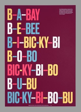
Combining the art of lettering and musical inspiration, artist David Pearson has collaborated with Commercial Type and Baddeley Brothers to produce an original limited-edition poster for the ‘Orchestra of Letters’ exhibition at Snape Maltings in Suffolk. The exhibition at the Lettering Arts Centre, to mark Snape Maltings’ 50th anniversary celebrations for its world-famous Aldeburgh concert … Read more