Chipperfield Stands Out With Bespoke Stationery

One of the world’s most influential architectural firms, David Chipperfield Architects, is making the right impression with a range of contemporary branded stationery from John Morgan Studio, created by die-stamping specialists, Baddeley Brothers.

The RIBA award-winning architectural firm, now the subject of an exciting exhibition at London’s Design Museum, is celebrated for creating subtle and sophisticated landmark buildings using its acute sensitivity for materials, throughout its global network of architectural practices. Communications design agency John Morgan Studio worked with the offices to create a new brand identity, which encapsulated the ethos and passion of David Chipperfield Architects’ work.

The clean, self-evident, unpretentious style created by the John Morgan Studio is ideal for many of the company’s electronic communications, though as the number of letters issued by the offices declines, it is essential to ensure its printed stationery, from business cards to presentation folders, make the right impact.

The simple typeface, monochrome style and absence of imagery, while suitable for David Chipperfield Architects’ multicultural network and subtle stance to branding, presented a unique challenge to the designers. They turned to a very traditional method of printing to create the authenticity and respect for materials that they hoped to convey with the brand identity.

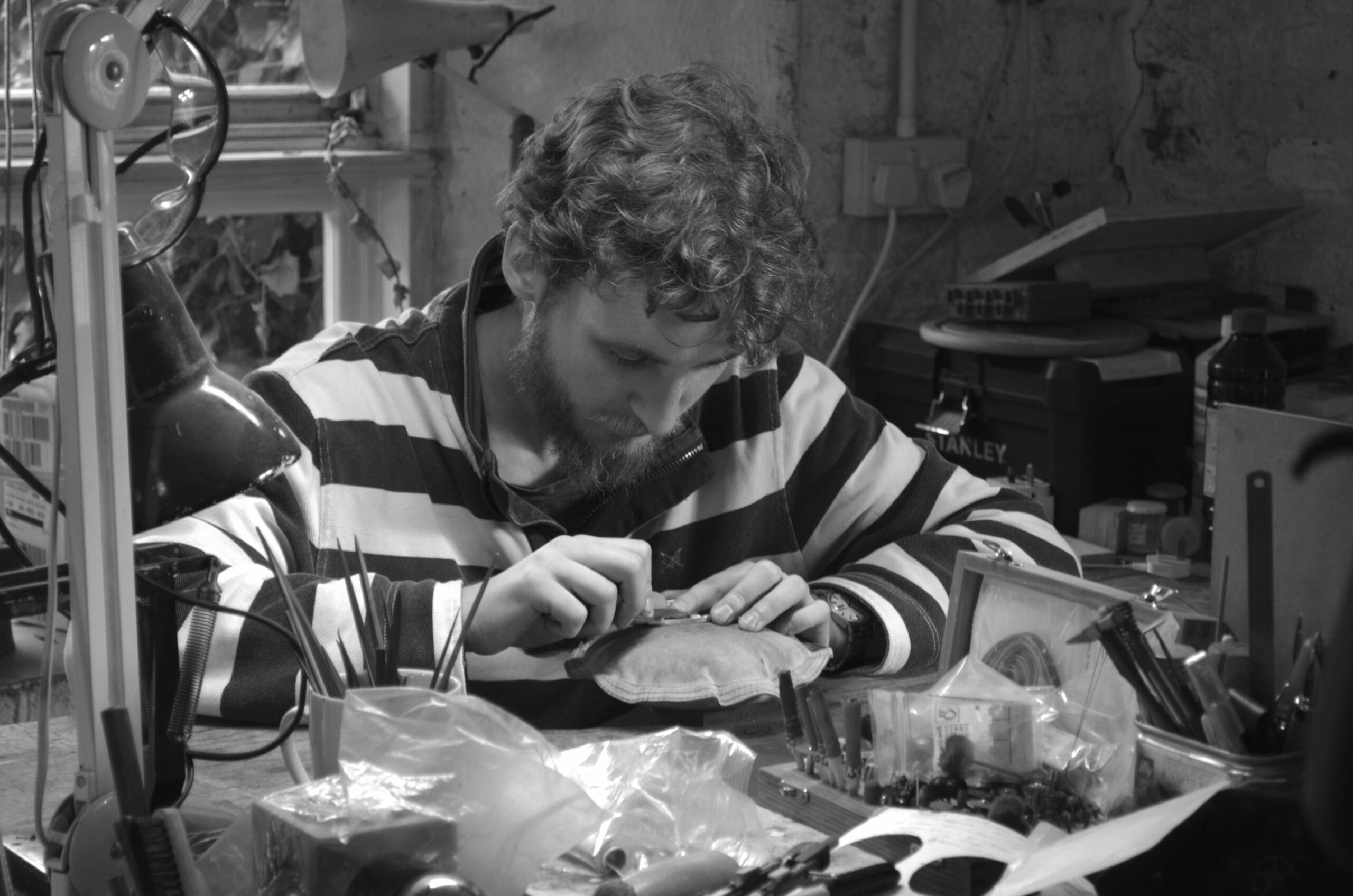
Interpreting the use of traditional printing methods in a very contemporary way, John Morgan Studio worked closely with the skilled artisans at Baddeley Brothers to create exactly the right look and feel, ensuring the printed page had a self-evident synergy with the work of David Chipperfield Architects. From selecting the right shade of white and the correct warmth of black, the printers and designers were keen to celebrate the quality of the traditional process, making the materials, inks and processes, individually significant.

Rik Nys, Head of Communications for David Chipperfield Architects commented: “Architects tend to choose bold colours and brash logos, but we were very keen to choose a subtle design that conveyed integrity. We were closely involved in the detail of the branding, with representatives from our Shanghai, Milan, Berlin and London offices at every meeting. The choice of using the beautiful embossed die stamping technique has been received extremely well, fulfilling expectations and meeting practical requirements. Our new stationery is close to being simply standard, but for those who choose to recognise the detail, it really stands out.”

John Morgan Studio Director John Morgan said: “Baddeley Brothers is quite simply the best at what it does. We have created David Chipperfield’s brand identity across a myriad of electronic formats, but the physical nature of stationery gave us the chance to make the process of production integral to the design, just as it is in the firm’s architecture. With fewer letters being sent, each one has to be more significant, more special, and embracing the imperfections of a traditional process is a key part of this. It’s ‘the salt in the soup’.”

The team at John Morgan actively participated in the printing process, enabling both companies to share visions and build a strong relationship. Die stamping was seen as a way to keep the design bare and beautiful, yet tactile. “It’s a very modern take, but one which demonstrates the continuity of tradition over time, connecting the artists of the past with the architects’ customers of the future,” added Baddeley Brothers’ Director Chris Pertwee.

“We’re always keen to work with designers who see the potential of these techniques in a contemporary creative industry. John Morgan Studio was determined to work with a specialist that could provide not only the unique skills necessary, but also the understanding, passion and respect for the trade, which would come across in the finished work. We have now supplied stationery to David Chipperfield Architects’ offices across the world and have been delighted with the response.”

You might also like...

Harry’s gold engraving shines to win 2025 competition

Harry Stokes fist-pumped the air when he learned he’d won our annual card contest. Run with the Hand Engravers Association, it featured blue engraved dunes and sky, with gold engraving wording and stars. His Christmas card two-colour design featuring the elements of the celestial night sky, captured the eyes of the judges this year. The ... Read more

Ginger Liqueur Letterpress label – one for the senses

Now and then a project draws you in, appealing to the senses and enthusiasm of a new product. Kaveri Drinks spent a lot of effort taste testing and then understanding the right way to launch ginger liqueur. But had difficulty finding someone to produce the labels to do the design justice and help launch and ... Read more

Protecting music – how Ravensbourne students packaged up a melody

A team of four second-year design students took part in this year’s Im-Print Im-Press collaboration between Baddeley Brothers, GF Smith, Foilco and Ravensbourne University. Twenty-year-old Will gave us an insight into the programme from his perspective. Will commented how precise and detail-oriented the print process is:: ‘…particularly when it comes to paper selection, foiling, and ... Read more

Seal the deal with personalised envelope portal

As the UK’s leading manufacturer of specialist envelopes, Baddeley Brothers is pleased to launch an online personalised envelope portal for clients to buy and customise a high-quality range of Colorplan products. The end-to-end service offers customers the flexibility to choose their colour, style and size in their own time. Then they have the option to ... Read more
Cream gold red christmas card with seasons greetings engraved in victorian text

Hand-engraving contest winner says craft is 90% inspiration, 10% engraving

An artist who can count some of the world’s best musicians as his customers, has won the 2024 Hand Engravers Associations Christmas Card competition, sponsored by Baddeley Brothers. When John Cook discovered he was dyslexic, he used his hands to express himself. At school, he excelled in crafts such as woodwork and metalwork, and when ... Read more

Paper space rocket project brings a team of six together in educational challenge

Building a paper space rocket may seem like a straightforward task, but when the process is split between six students collaborating on a design project, the team had to be firing on all boosters. Ravensbourne University organised and hosted the annual Im-print Im-press event, sponsored and judged by Baddeley Brothers, Foilco, and GF Smith. In ... Read more

Ibrahim’s snowflake engraving melts the heart of HEA judges

A Cambridgeshire man who has been engraving for 10 years, has triumphed in the Hand Engravers’ Association Christmas card competition. Ibrahim Batchelder entered a design that encapsulated the frozen close-up geometry of a snowflake. And the winning piece was silver die-stamped by Baddeley Brothers, who sponsor the competition every year. The snowflake design took Ibrahim around four days to complete. ... Read more

V&A museum project highlights how the die-cutting process and envelope-making are relevant to everyday home life.

A filming project that features the craft of the die-cutting process and envelope-making happening right on our doorstep was too good an opportunity to miss. The production team at the Victoria and Albert Museum, who wanted to document our industrial manufacturing processes alongside domestic procedures, contacted us last year. And it is just part of ... Read more

Is it curtains for traditional paper as FibreLab recycles textile waste into paper for printing and packaging?

A collaboration with a textile company has yielded impressive results after fibres from discarded cloth have been successfully recycled into paper products that can be printed on. Baddeley Brothers has been working with FibreLab to test printing on Papertex, the name being given to an innovation by the East London company. FibreLab is a hyper-local ... Read more

Art catalogue cover for the Gagosian Gallery is ‘a wonderful illustration’ of what 9-colour die-stamping can achieve

A casebound book cover that catalogues an abstract art exhibition for the Gagosian Gallery was a perfect fusion of art and craft, and a meeting of minds for Baddeley Brothers and Paul Neale, Creative Director with Graphic Thought Facility. To Bend The Ear Of The Outer World is a catalogue to accompany an exhibition of ... Read more