When ilody Skincare launched, it was only natural for a company making beauty products to care deeply about how it looked on the outside.
The quality and integrity of the serums produced by founder Deepika Patel are a life-long culmination of ayurvedic and orthodox medicine, an Indian upbringing, a career in fashion and desire to use only the most natural ingredients.
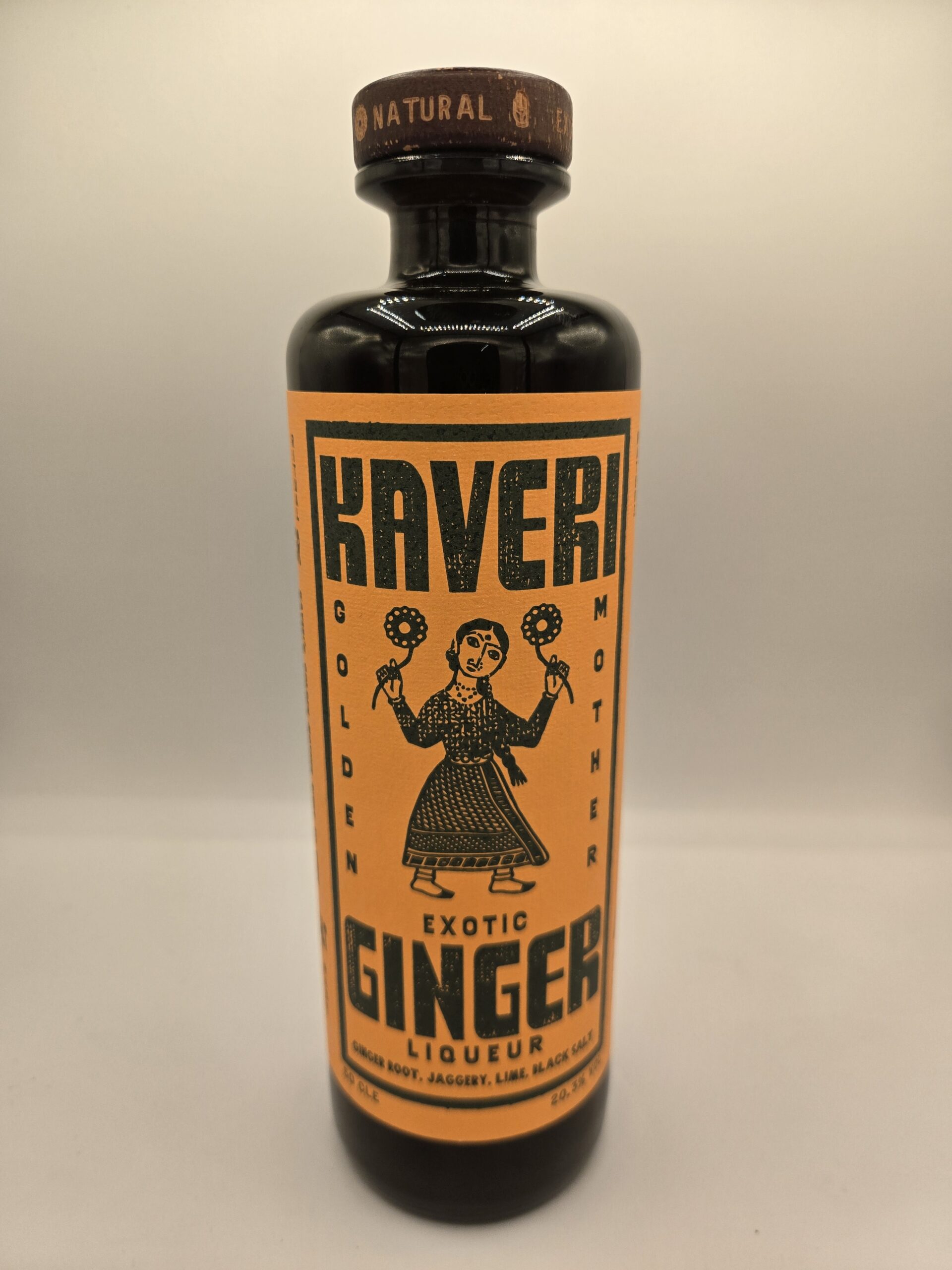
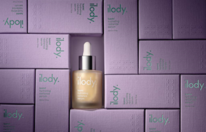
A product’s packaging must tell a story of what’s inside, and the result produced by designers StudioThomson and printers Baddeley Brothers, show that design is more than skin deep.
Eastern promise
Portobello design agency StudioThomson were commissioned to produce luxury packaging for two new products from ilody. It is no coincidence that the studio has a number of customers in the fashion business, such as Turnbull and Asser, Richard James, Preen, and more. As with any brief, brothers Chris and Mark Thomson who run the agency together, set about doing their homework.
Chris said: “Dee’s Indian heritage was very important in the development of her products, so we wanted to make that became visible in the packaging. The sari is a cultural icon in the Indian subcontinent, and we sought inspiration from its vast array of colours and patterns. These are very much embodied in their designs, without being overpowering.
“We came up with a style that had a feel of luxury and modernity, yet also had the nuances of tradition.
“Thinking about this, we initially considered wrapping the bottles in fabric, but eventually chose a traditional card box that would have a fabric feel, in fact the stock is called ‘silk weave’ because of its fine woven texture. The colours we chose were light and dark so we wanted to print it with something that would shine out from the lavender and cobalt extremes of pale and deep.
“We spoke to Foilco, whose diverse foil range and knowledge really inspired us. Their input influenced and elevated the design.
“Foilco also suggested we speak to Baddeley Brothers who have a long history of foil blocking and looking through their archive was incredible. It was clear they knew their business and could do what we were asking.”
Printing without ink

The challenge StudioThomson put to Baddeley Brothers was to foil the brand name and product details onto an embossed stock, maintaining the flat mirror quality that makes the reflective nature appealing. And then to blind emboss detailed cultural symbolism through the existing card’s inherent texture.
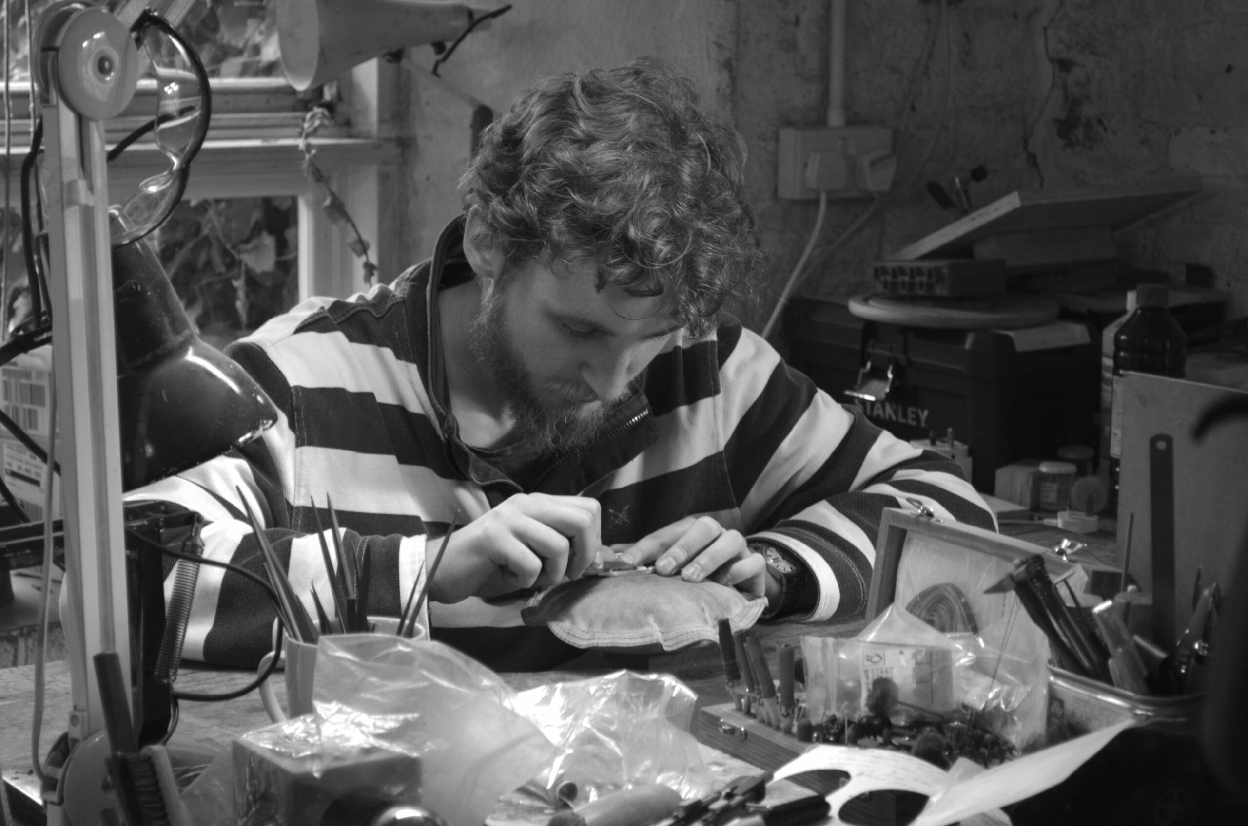
At Baddeley Brothers the combination of these techniques is just one of a myriad of print combinations that go to make every piece we print unique. The permutations from our skillset is immense.
As one of London’s, if not the UK’s, longest established specialist printers maintaining the classic print crafts, the ilody project was something to get excited about. We could feel it before we saw it.
Chris Pertwee, production director, said: “I think it’s fair to say there was some initial nervousness regarding the outcome. From a design point of view, there’s the colour and texture of the stock, the foiling and embossing both potentially agitated by the woven texture in the card. It’s our job to offer advice and reassurance that the subtlety of the printing process won’t be lost when the cartons are finished, folded and on the shelf.
“Our printers have a lot of experience of classic techniques, and we offered reassurance that the end result would meet the requirements of the brief.”
“We met at an early stage with the client and the designers, and in fact we invited Dee to see the packaging being printed. It’s a short run, but requires multiple passes through different presses, it’s labour-intensive, but it’s also a thing of beauty. It has a luxurious feel, which of course is the very nature of the product.”
“The finished product shows how a simple design can be elevated by using one or more of these printing methods.”
Dee Patel described the development of the brand as a very personal one, which draws on her own heritage. She said: “It’s been invaluable to work with Chris and Mark on finding ways to reflect upon this but also to drive the brand into a modern setting and give it’s contemporary feel.
“Working then with Baddeley Brothers was another layer of finesse to the final products, their expertise in specialist printing allowed both myself and StudioThomson to have not only a great confidence in what the final product would like look but a chance to develop a creative collaborative relationship which we hope can continue with the brands growth and expansion.”
The final product is something all parties are justifiably proud of.
Dee added: “It delivers not only on an aesthetic, modern and luxury level but also helps to tell the story of the brand. The execution of the final products has already been well received by the industry.”