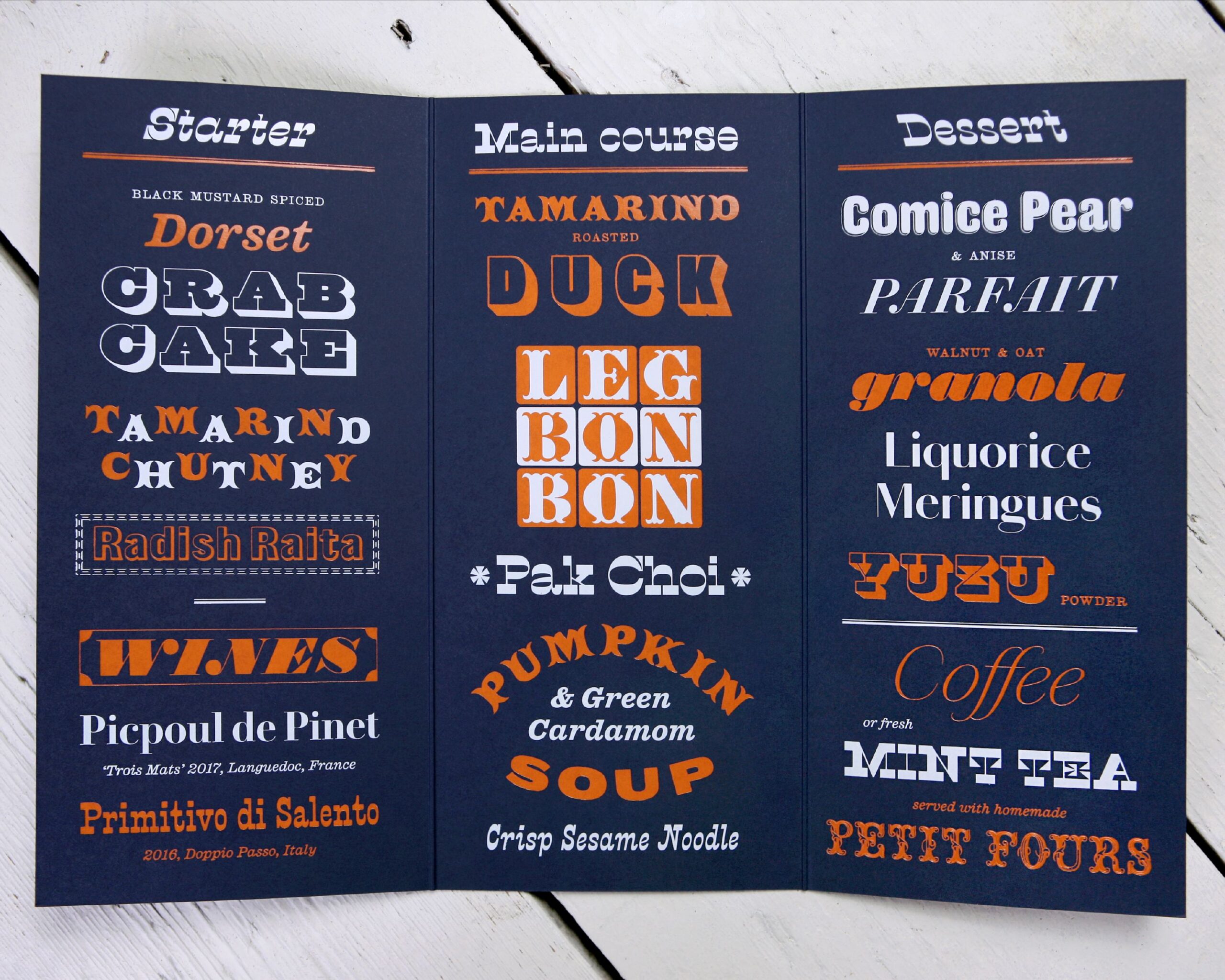
Attention to detail
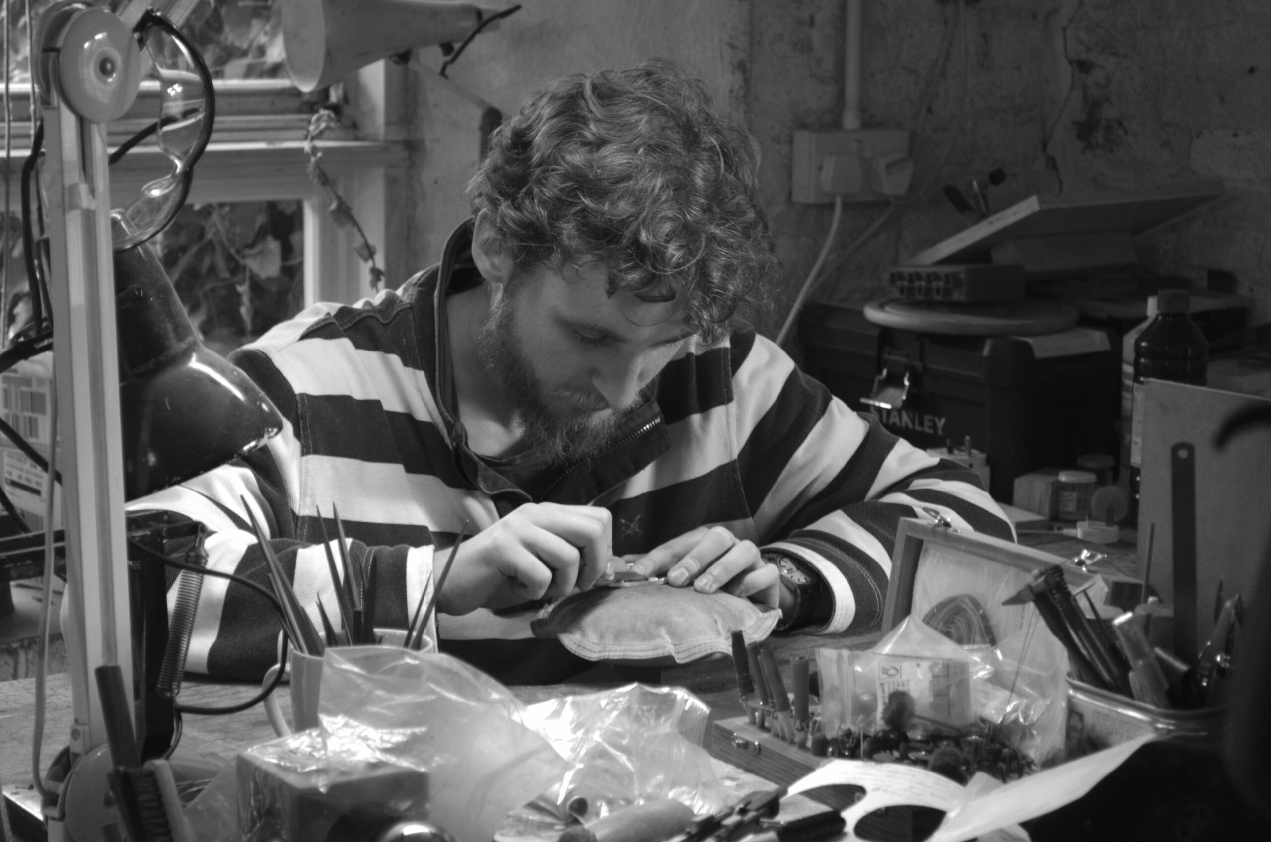
Sample testing the material to see how well it performed once scored. Would it stand/sit on the table in a perfect, presentable way?


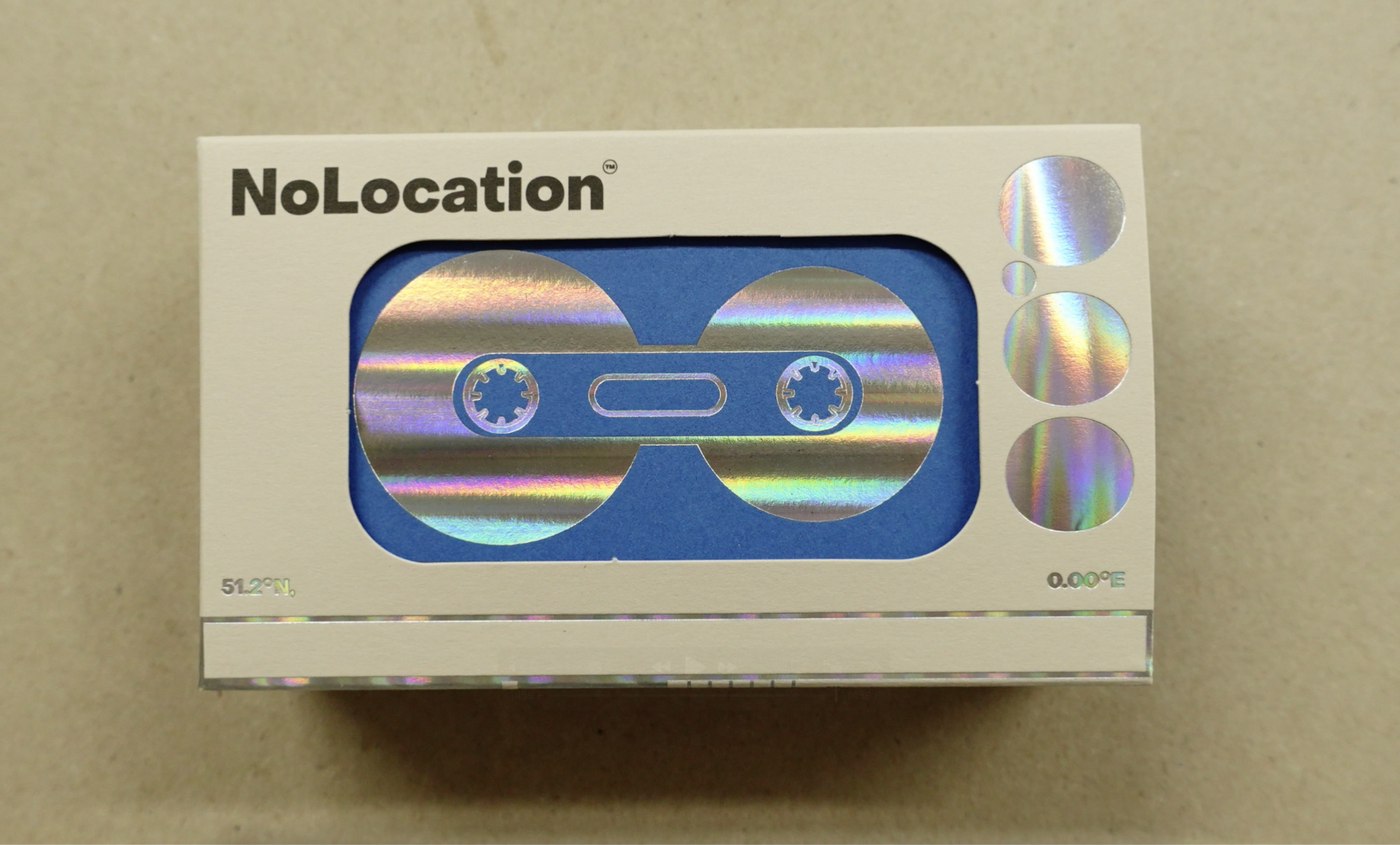
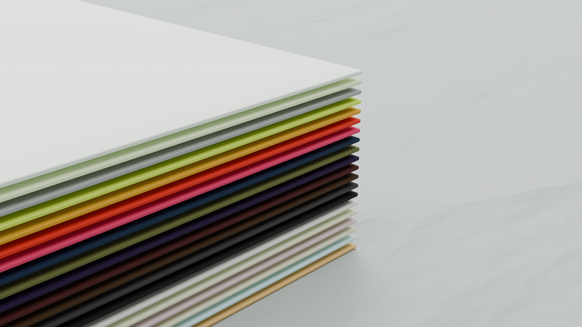
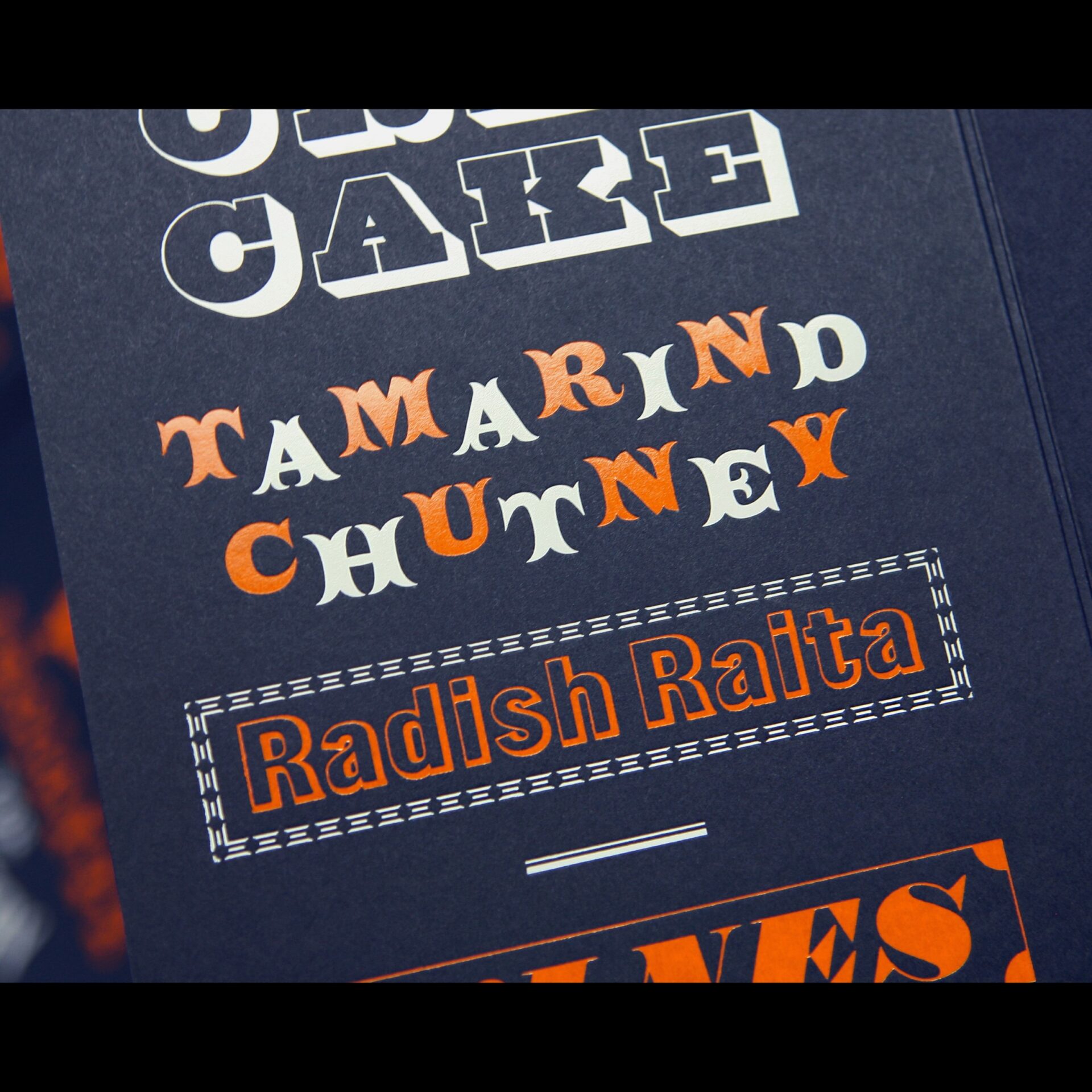
In addition, there was a lot of discussion about what foils and shades of material would not only look right in a darken room but also how they would perform together. In particular, how the fonts would reproduce on the sheet with different types of foil. Eventually Vanguard Navy Blue 299gsm and Foilco gloss white (GPG/900) and gloss orange (7000) were chosen.
On Press


The Result



What was said:
David Pearson – Type As Image – “I was recently given the honour of designing the table setting for a very special meal; a meal that marks the appointment of the new Royal Designers for Industry (this year’s very worthy recipients can be seen in picture 4 directly above). I didn’t exactly give the printer a place to hide – but they laughed in the face of my wispy hairlines. The quality of the printing is incredible, as it always is with Baddeley Brothers. A huge thanks to Charles Pertwee who couldn’t have been more helpful during the production process.
And a massive, massive thanks to Paul Barnes, who gave me the keys to the Commercial Type sweet shop (I didn’t leave until I was full) and to Ellmer Stefan for supplying the only typeface that should ever be used to set ‘Leg Bon Bon’. I’m very lucky to get to work with all these incredibly talented people.”


