Two students from Ravensbourne University have once again created an inspiring piece that celebrates uniqueness.
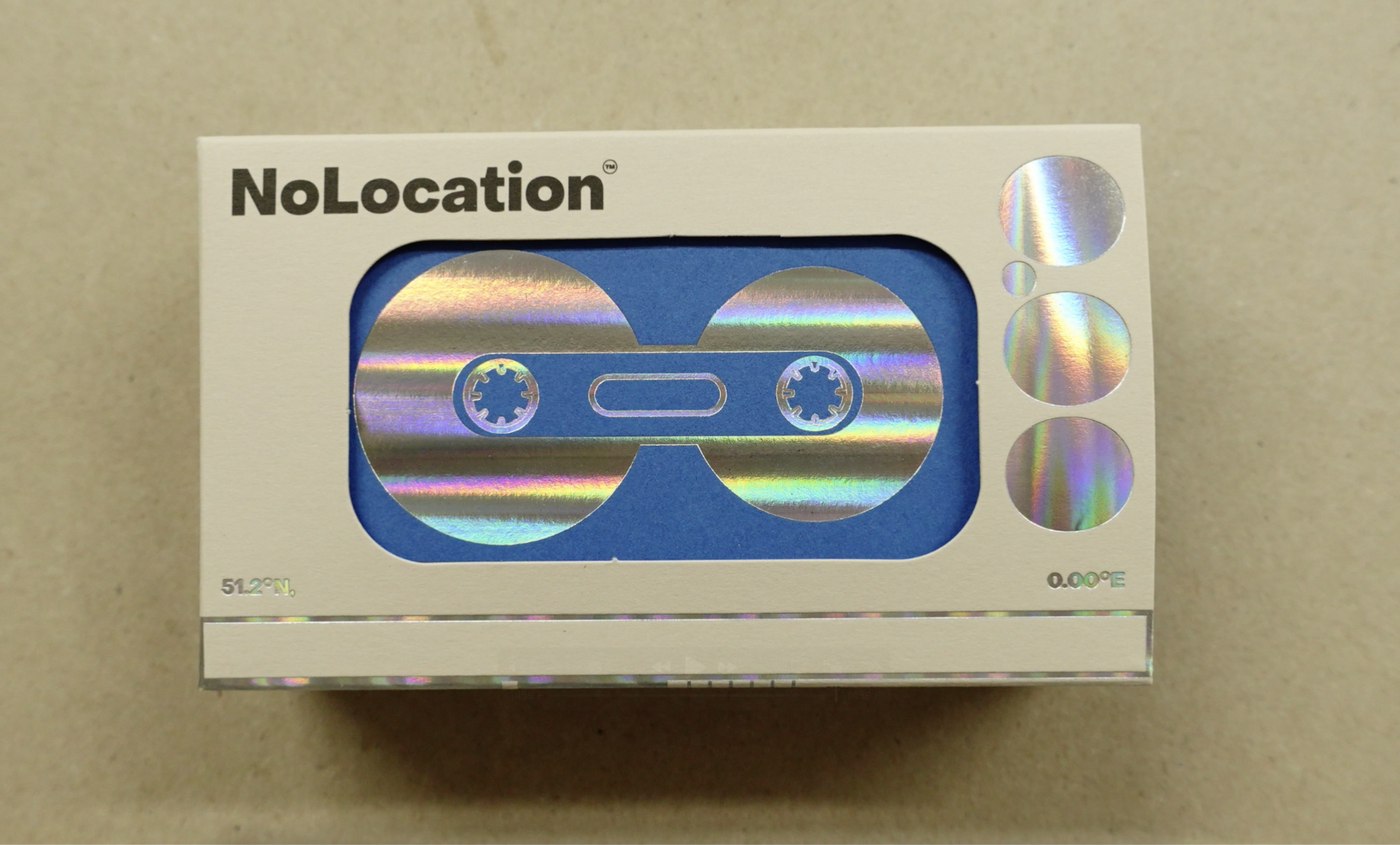
Rose Lwin and Jada Perry elected to take part in the Imprint Impress project, which is a collaboration between Baddeley Brothers, the university, GF Smith Papers and Foilco. Together they designed, costed and produced a piece for print, using only foil blocking, folding and die-cutting to create a paper sculpture called ‘We Are One’.
The concept represents the idea of togetherness and that we should all be treated as equals as a human race, and the piece represents what an ideal future in society would look like, with lots of different identities coming together as ‘one’.
Jada and Rose are studying design at Ravensbourne, and Jada said as a lot of her work is digital, she relished the chance to work outside her comfort zone with something tactile and physical.
She said: “I chose the Imprint! Impress! project as I liked the idea of working on something very tactile and physical. I find my work is often digital-based, so I thought to take myself out of my comfort zone.
“Rose and I applied to the project separately, not knowing each other, and I am so glad we were paired as a team as I feel we were a dynamic and cohesive pairing.
Cohesive pairing
“I felt so proud that our hard work and time had been recognised and truly paid off. It was an amazing yet quite shocking feeling knowing that out of all the amazing and versatile submissions, ours stood out most to the judges.”
The main inspiration for the duo’s piece was to represent their ideal future as a paper, foil and de-bossed installation.
“Our ideal future would be inclusive of everyone. One where everyone’s uniqueness is accepted and celebrated. This resulted in Rose and I creating a piece that tessellated, Jada continued.
“From this experience, I hoped to learn the technical side of taking digital designs into practical/physical pieces. I also wanted to enhance how to work efficiently and cooperatively together with a partner successfully.
Broadening horizons
“I learnt far more than expected from this experience. I was able to understand the very technical sides of print and all its finer details. I also learnt just how many ways there are to produce printed outcomes and the astonishing effects that can be created. I also broadened my horizons with different materials – in particular foil. “
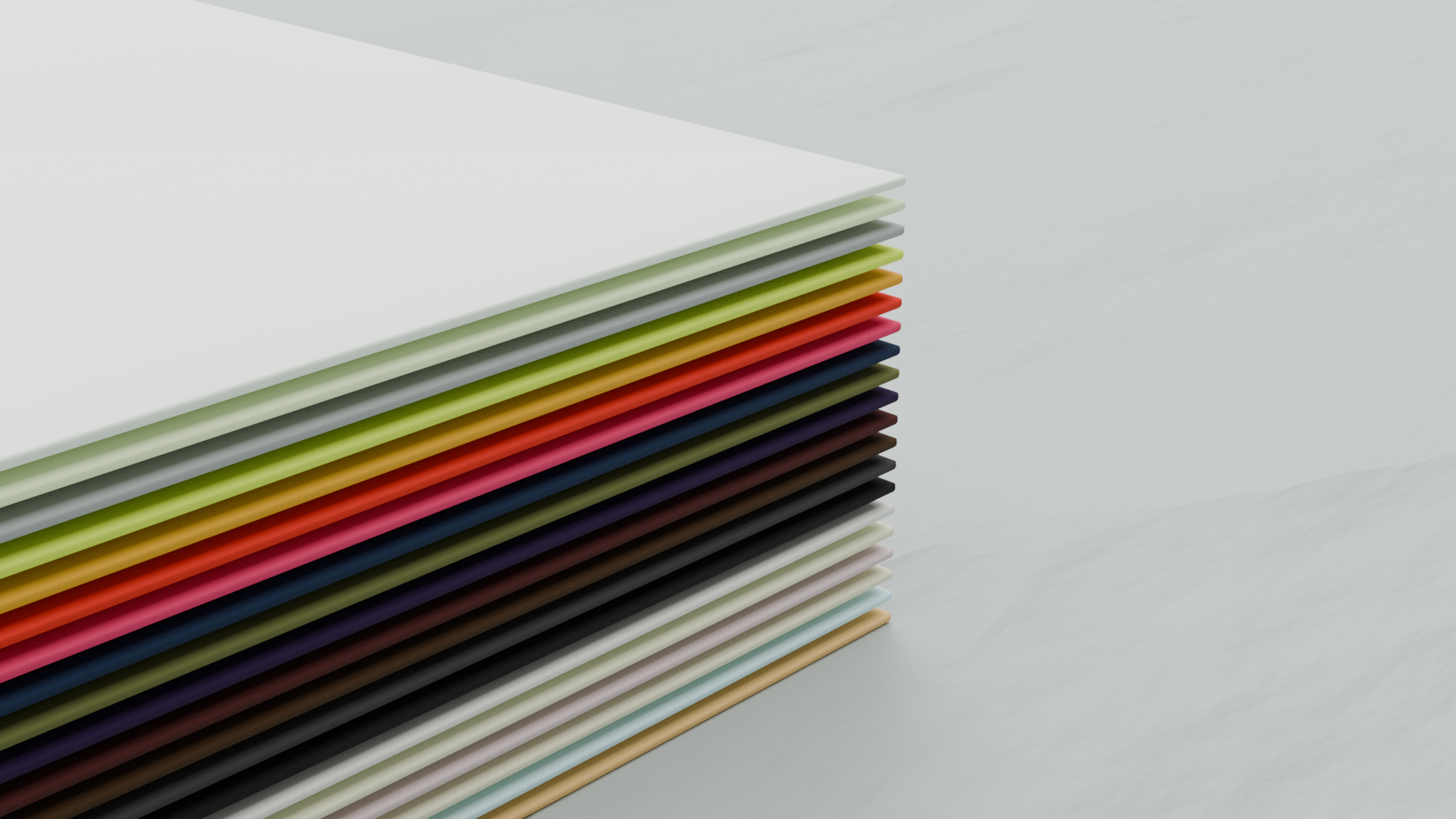
In 1972, GF Smith launched the Colorplan range. The brief this year encouraged students to look back and then forward a further 50 years. Linking in elements of Utopias and Hauntology – providing a persistence of the past, and a nostalgia for an unrealised future.
Charles Pertwee, Commercial Director at Baddeley Brothers, said: “The entries for this year can be divided into three general areas: technology, commentary on society, and environmental consciousness. Previously, we’ve had a lot of box designs that didn’t work. Rose and Jada’s is the first installation of its kind that does – the message is instantly recognisable.”
Jada also commented on the help she got from Baddeley Brothers during the process.
“Baddeley Brothers were so helpful throughout the whole process, they assisted Rose and I from the beginning to the end.
“During the project, Rose and I faced a few technical issues such as setting up our file to send to be printed, as this wasn’t something either of us had done before. After liaising with Charles and Steve, they instantly reassured us and talked us through the file specifications. For us, this was extremely valuable, as we are now knowledgeable in setting up files for print.”
“At our initial meeting, they advised us of structures that would and wouldn’t work with the foiling and die-cutting processes, which gave us time to really refine our ideas, right down to small details that may cause issues in the process.
Rare opportunity
“When we visited Baddeley Brothers, all the staff were amazing and accommodating. At each step of the process, we were treated to a tour of each piece of machinery and its capabilities. I learned about so many different machines which is amazing to see as a graphic designer, as we often rarely get to see this process in action physically.
“I was so impressed with the final outcome it had a real professional and sleek finish. Everything came out exactly how we wanted it to. Using three different paper colours really enhanced ‘We are One’ as, although different, they all fit together perfectly.”


