A Type of Treasure Trove

Foil blocked gold on Vanguard

The Gentle Author and designer David Pearson have launched a new book. One which celebrates illustration, words, typography, print and design. An eminent list of artists collaborated on the project, and David spoke of his involvement at the launch at St Bride Library. The book tells the story of a family business, Baddeley Brothers.

In an inspiring insight into his involvement with the book, David reflected on the opportunity to glimpse into the lives behind an illustrious family tree – filled with amazing connections and locations that help tell a story of British type and design. “It has proven to be that rare project which brings everything you love together.”

We invited him to the Baddeley Brothers factory, where he “opened a treasure trove of wonderful paper engineering, which are quite simply the most delightful things to find in a box.” He wanted to photograph everything, from period pieces to type specimens.

Highlighting one photograph, David focused on his delight to find a highly detailed brass plate, claiming it reminded of him of “a kiss effect, just like two brothers”. No wonder he chose it as the perfect photograph to mark the start of the story of Baddeley Brothers.

Playing with type and layout
JJ Baddeley's copperplate business card
JJ Baddeley’s copperplate business card

As well as searching the archive for illustrative photographs and specimens, David took inspiration from the factory locations and work he discovered to choose the type for the book. His fondness for the Caslon Letter Foundry, a neighbour of Baddeley Brothers from 1885 to the early 1940’s, led him to Caslon Doric, which he felt “had the smell of the industrial revolution”. From there, he chose a suite of typestyles to liven the pages, for the printing glossary, envelope descriptions and progressive chapters.

Baddeley Brothers book Blind emboss Caslon Dorie typeface
baddeley brothers

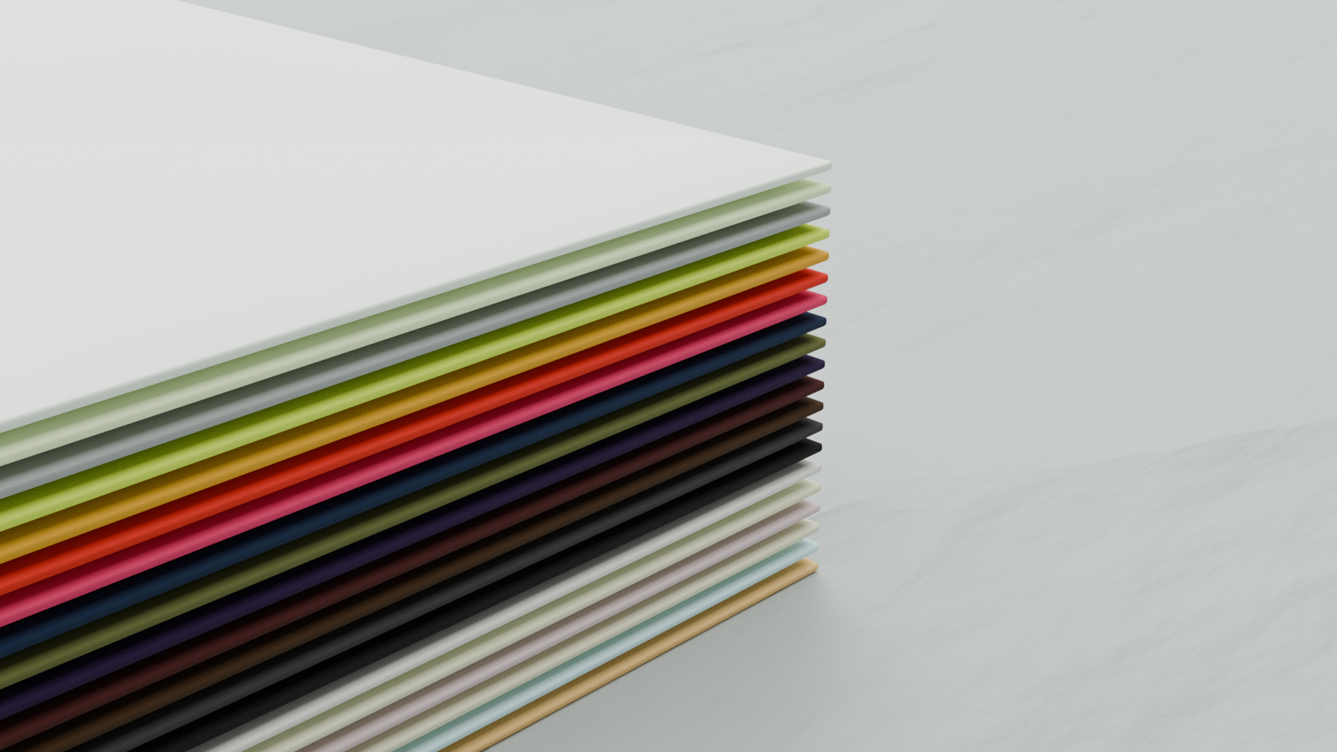
He was given the opportunity to experiment by matching old fashioned typestyles with pop colours, through which he developed a colour palette that “was not locked in the past, but reflected the chronology of each chapter, becoming punchier as you progress through the book”. Using four colours, David created a rhythm, shifting tone and temperament between each chapter and mirroring the evolution of the company and designs it was shaping.

These colours were used for the drawings by Lucinda Rogers, who David said “has an amazing energy and spontaneous style that has real integrity and mirrors the Gentle Author’s writing style in many ways.”

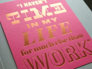
The tip-ins, which use the Gentle Author’s words, found David working with type in the way that he is most comfortable. He wanted to break up the chapters with decorative flourishes, which showcase the skills of the craftsmen at Baddeley Brothers.

baddeley brothers
baddeley brothers

For the cover, David chose the logo. Suggestive and intriguing, we agreed that it hints at the contents without giving too much away. Discussion at the launch about the logo reflected that it has remained unchanged through the years – that can be distorted and added to – yet remains, at its core, a recognisable brand that is as relevant today as it was in 1865. I’m delighted that David deemed it compelling enough to adorn this “tale of many Baddeleys”.

baddeley brothers

To order, visit www.baddeleybrothers.com/book.

You might also like...

Harry’s gold engraving shines to win 2025 competition

Harry Stokes fist-pumped the air when he learned he’d won our annual card contest. Run with the Hand Engravers Association, it featured blue engraved dunes and sky, with gold engraving wording and stars. His Christmas card two-colour design featuring the elements of the celestial night sky, captured the eyes of the judges this year. The ... Read more

Ginger Liqueur Letterpress label – one for the senses

Now and then a project draws you in, appealing to the senses and enthusiasm of a new product. Kaveri Drinks spent a lot of effort taste testing and then understanding the right way to launch ginger liqueur. But had difficulty finding someone to produce the labels to do the design justice and help launch and ... Read more

Protecting music – how Ravensbourne students packaged up a melody

A team of four second-year design students took part in this year’s Im-Print Im-Press collaboration between Baddeley Brothers, GF Smith, Foilco and Ravensbourne University. Twenty-year-old Will gave us an insight into the programme from his perspective. Will commented how precise and detail-oriented the print process is:: ‘…particularly when it comes to paper selection, foiling, and ... Read more

Seal the deal with personalised envelope portal

As the UK’s leading manufacturer of specialist envelopes, Baddeley Brothers is pleased to launch an online personalised envelope portal for clients to buy and customise a high-quality range of Colorplan products. The end-to-end service offers customers the flexibility to choose their colour, style and size in their own time. Then they have the option to ... Read more
Cream gold red christmas card with seasons greetings engraved in victorian text

Hand-engraving contest winner says craft is 90% inspiration, 10% engraving

An artist who can count some of the world’s best musicians as his customers, has won the 2024 Hand Engravers Associations Christmas Card competition, sponsored by Baddeley Brothers. When John Cook discovered he was dyslexic, he used his hands to express himself. At school, he excelled in crafts such as woodwork and metalwork, and when ... Read more

Paper space rocket project brings a team of six together in educational challenge

Building a paper space rocket may seem like a straightforward task, but when the process is split between six students collaborating on a design project, the team had to be firing on all boosters. Ravensbourne University organised and hosted the annual Im-print Im-press event, sponsored and judged by Baddeley Brothers, Foilco, and GF Smith. In ... Read more

Ibrahim’s snowflake engraving melts the heart of HEA judges

A Cambridgeshire man who has been engraving for 10 years, has triumphed in the Hand Engravers’ Association Christmas card competition. Ibrahim Batchelder entered a design that encapsulated the frozen close-up geometry of a snowflake. And the winning piece was silver die-stamped by Baddeley Brothers, who sponsor the competition every year. The snowflake design took Ibrahim around four days to complete. ... Read more

V&A museum project highlights how the die-cutting process and envelope-making are relevant to everyday home life.

A filming project that features the craft of the die-cutting process and envelope-making happening right on our doorstep was too good an opportunity to miss. The production team at the Victoria and Albert Museum, who wanted to document our industrial manufacturing processes alongside domestic procedures, contacted us last year. And it is just part of ... Read more

Is it curtains for traditional paper as FibreLab recycles textile waste into paper for printing and packaging?

A collaboration with a textile company has yielded impressive results after fibres from discarded cloth have been successfully recycled into paper products that can be printed on. Baddeley Brothers has been working with FibreLab to test printing on Papertex, the name being given to an innovation by the East London company. FibreLab is a hyper-local ... Read more

Art catalogue cover for the Gagosian Gallery is ‘a wonderful illustration’ of what 9-colour die-stamping can achieve

A casebound book cover that catalogues an abstract art exhibition for the Gagosian Gallery was a perfect fusion of art and craft, and a meeting of minds for Baddeley Brothers and Paul Neale, Creative Director with Graphic Thought Facility. To Bend The Ear Of The Outer World is a catalogue to accompany an exhibition of ... Read more