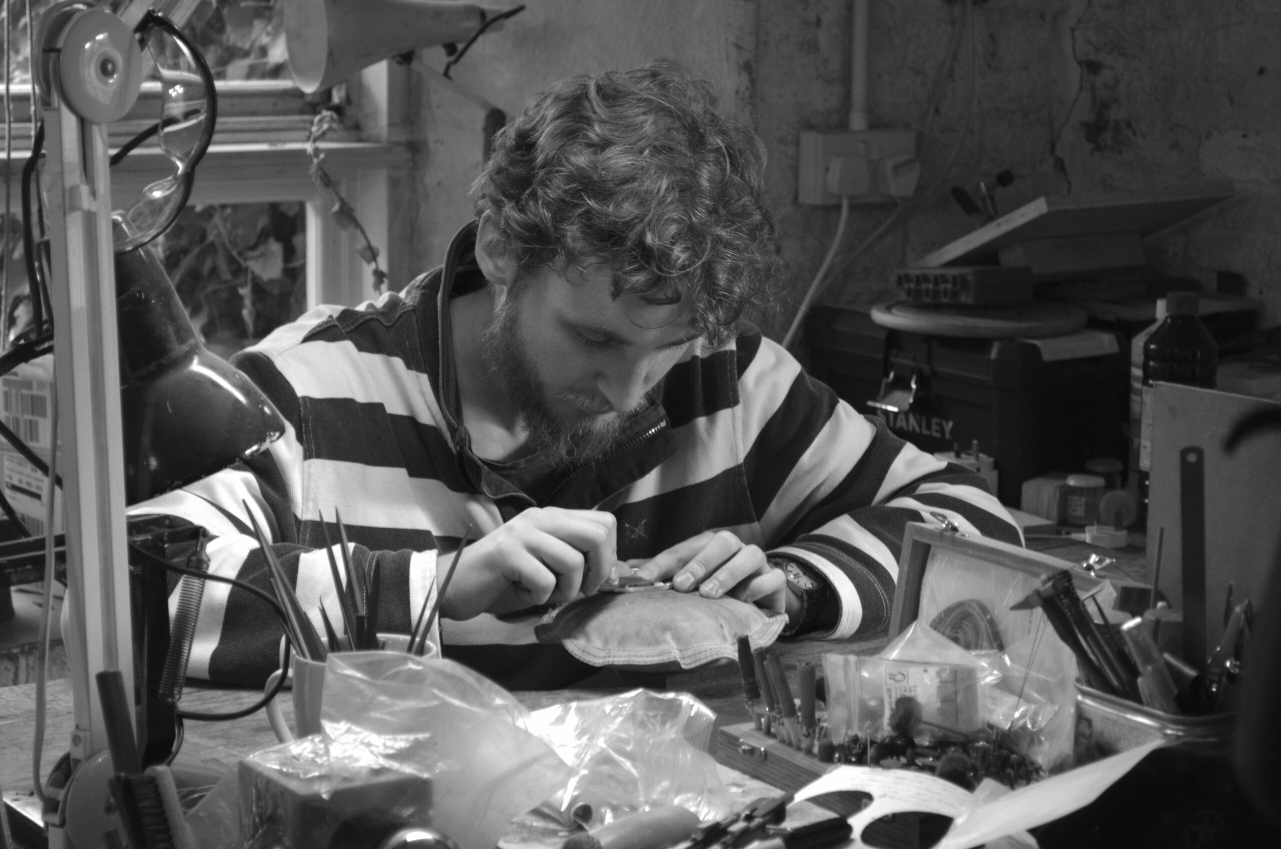
Now and then a project draws you in, appealing to the senses and enthusiasm of a new product.
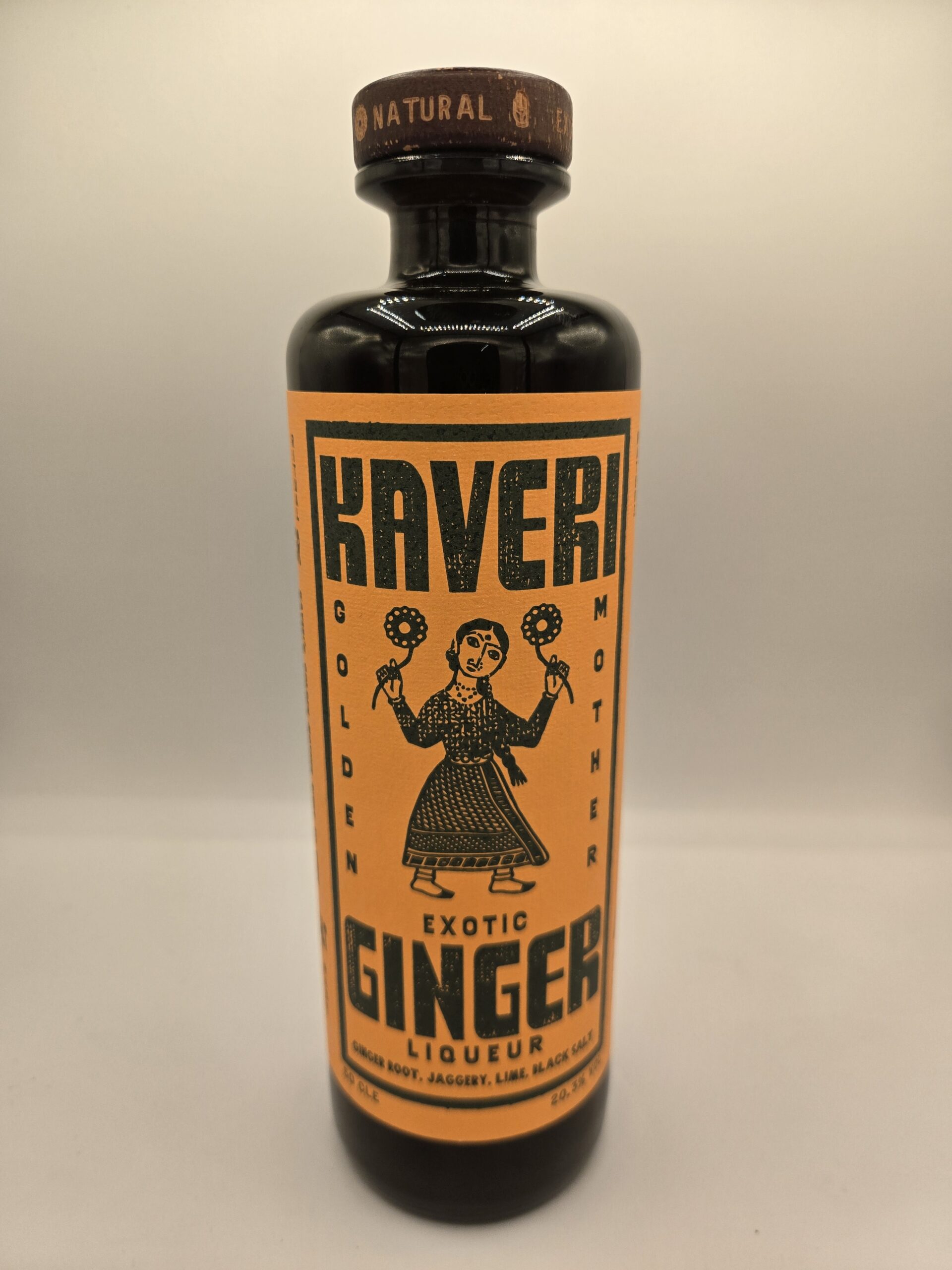
Kaveri Drinks spent a lot of effort taste testing and then understanding the right way to launch ginger liqueur. But had difficulty finding someone to produce the labels to do the design justice and help launch and sell the product.
The last piece of the jigsaw seemed to slot into place when they found Baddeley Brothers. The product’s finishing point became obvious.
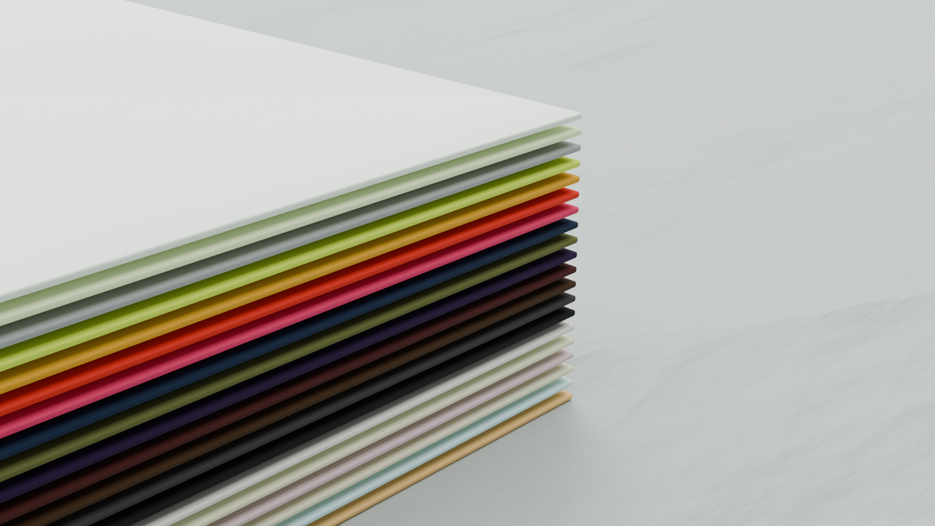
After several calls, sample requests, and a factory visit, we chose the stocks, colours, and techniques.
A key decision made was to create a custom de-boss linen weave pattern. Created by Baddeley Brothers, there were no other available options that met the specific desired look.
Using Fedrigoni Meterica Gesso 106gsm and Woodstock Bettula 80gsm. The label stock was flood printed a tumeric gold 135U, followed by letterpress: 498U (purple) & 5815U (green).
The key technique is the letterpress printing process. The stressed, imperfect label design by We are Land is an important element of the brand. This uses the font – Form Sans by Julia Quesnel Welch. This is “inspired by a variety of references spanning from western cowboy culture to the geometric shapes of the post-modern, industrial era”. And using the letterpress technique enhanced these elements.
It all worked out. Kaveri Ginger Liqueur won the Gold prize for the World’s Best Spice Liqueur at the World Liqueur Awards 2025.
The liqueur includes ginger from – Peru, Thailand, and often Karnataka. The jaggery comes from Tamil Nadu, suspended somewhere between raw and refined. The Himalayan salt adds texture. Traditional amchur, raw mango and lime bring a citrus edge.
Label Print @baddeleybros
Creative & Art Direction @makingitknown
Website Design & Font-Form Sans @juliaqwelch
Drinks Stylist @robbiedwhite