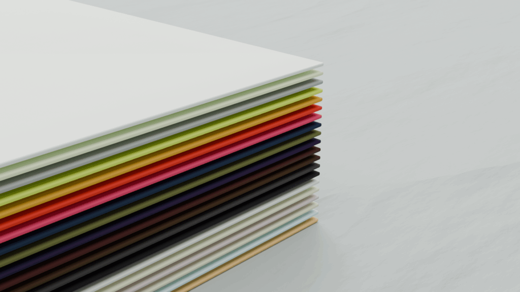
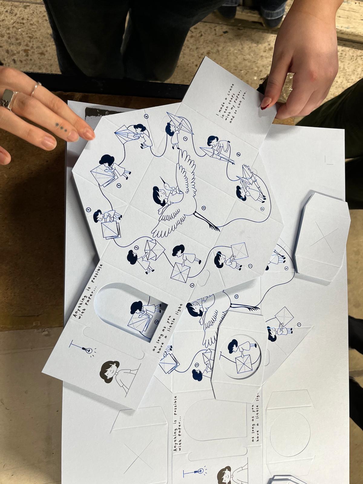
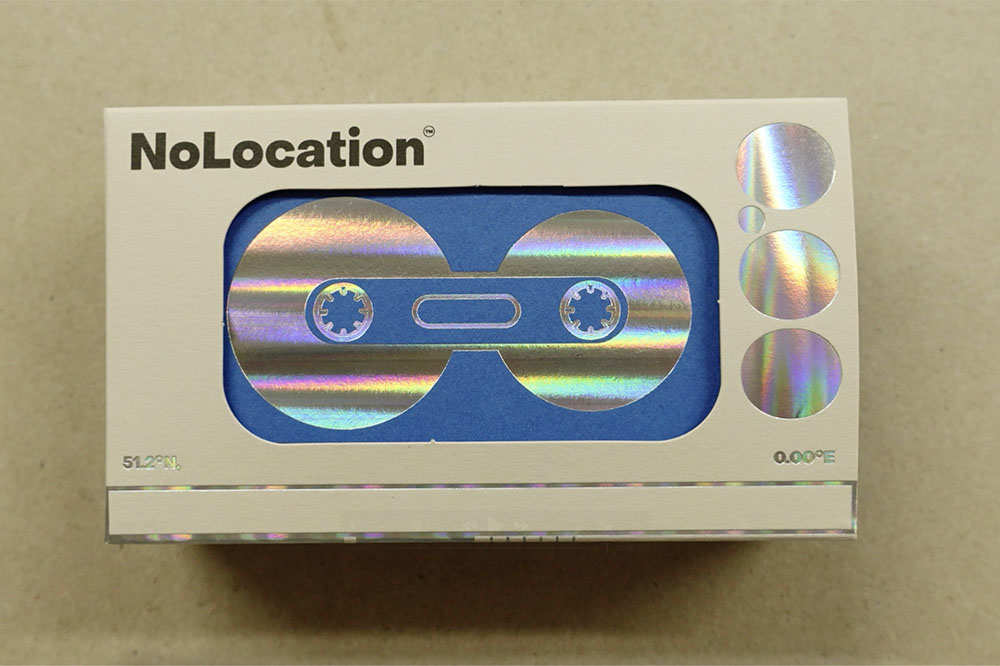
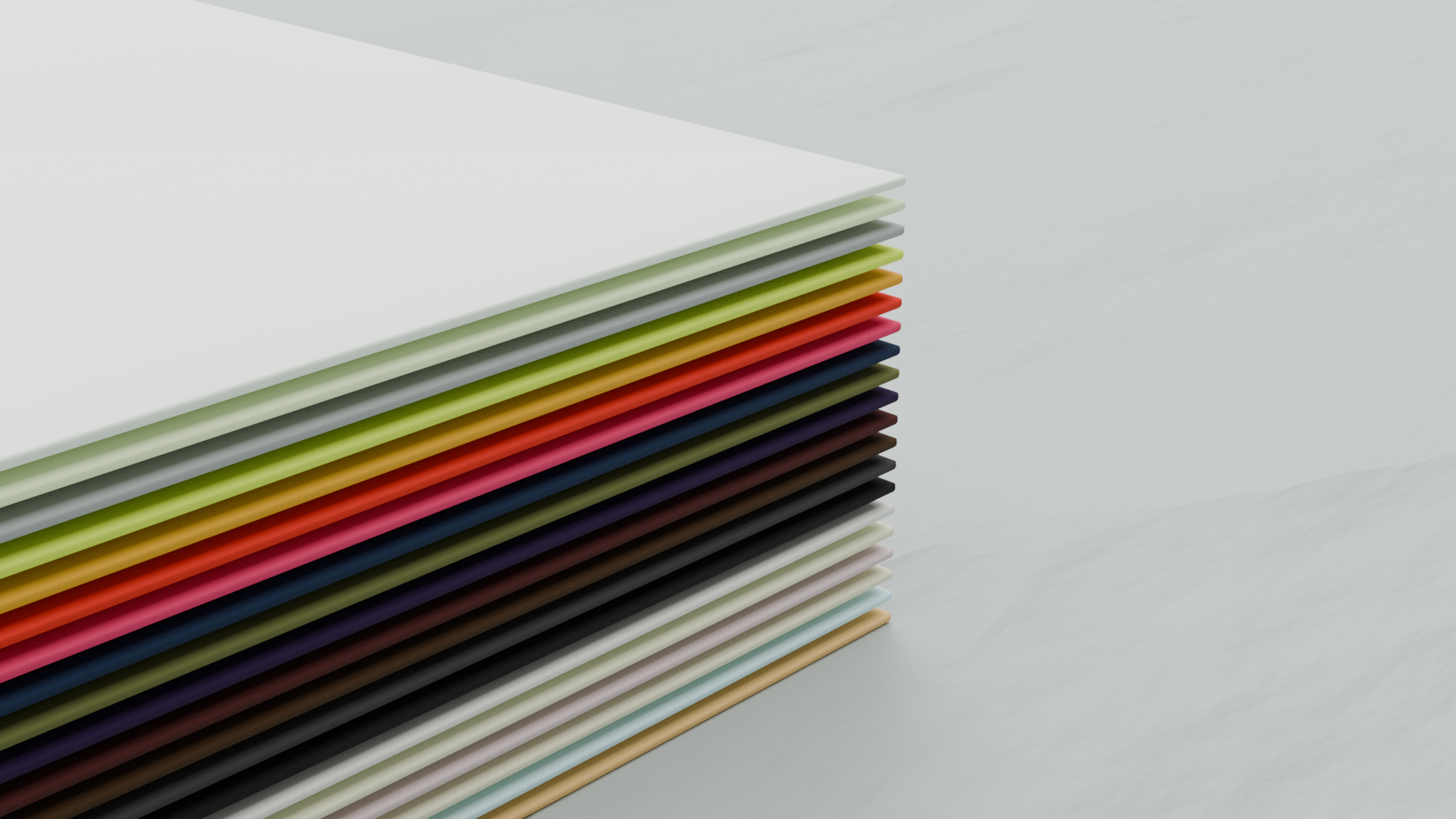
Long before a single letter is die-stamped, embossed or set in foil, a decision has already been made that shapes everything else: the paper.
At Baddeley Brothers, we’ve been specialist printers of luxury stationery, envelopes and finely-crafted packaging for almost two centuries. In that time, one truth hasn’t changed – the stock beneath the ink is never a background detail. It’s the first thing a hand feels, and often the reason a piece is remembered at all.
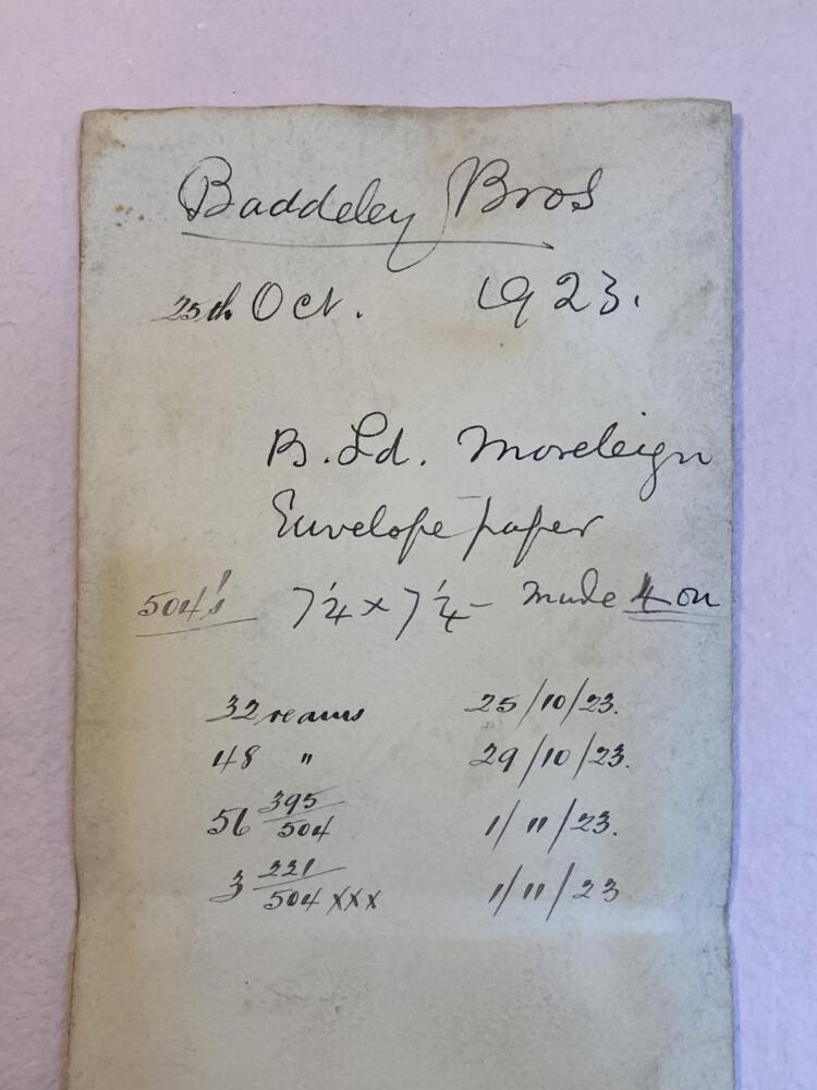
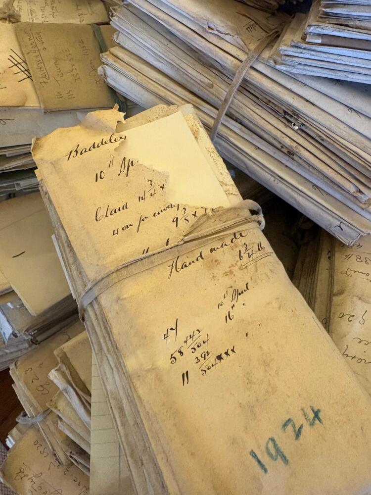
Often commissioning bespoke paper makings ourselves, here are five reasons paper choice deserves as much thought as the design itself:
1. It’s felt before it’s read
A recipient forms an impression of a piece of print the moment it reaches their hand – before a word is read. Weight, surface and stiffness all speak before the message does. A heavyweight card stock, chosen and finished with care, signals permanence and craft; a thin, flimsy sheet undercuts even the most polished design. For invitations, business stationery, and correspondence cards, this first tactile impression is often the only chance you get.
2. It carries the craft
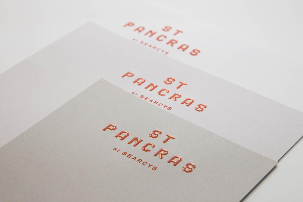
Techniques such as die-stamping, blind embossing, foil blocking, and letterpress each demand a particular kind of paper to perform at their best. A cotton-rich or uncoated stock can hold the deep impression of a die-stamped crest in a way a coated sheet never will; foil sits differently again. Choosing the right paper isn’t separate from choosing a print technique; the two decisions are made together, or not well at all.
3. It shapes colour and detail
Coated and uncoated papers render colour in genuinely different ways. A sealed, coated surface holds ink cleanly and produces sharper, more vibrant reproduction – well suited to photography-led catalogues or bold branded colour. We mostly use uncoated stock that absorbs ink more softly, giving a warmer, more understated result that many luxury and heritage brands prefer precisely because it feels less manufactured, more considered. Neither is superior; the right choice depends on the story the piece is telling.
4. It signals durability and intent
Weight, measured in GSM, is a practical signal as much as an aesthetic one. A lightweight sheet suits a letter that will be read once and filed; a heavier card, chosen for an invitation or a folder, tells the recipient it’s meant to be kept. Matching paper weight to purpose is a small decision with a large effect on how long and how carefully a piece of print is handled.
5. It’s part of the brand, not an afterthought
For businesses investing in print, packaging, or event stationery, paper is a design decision in its own right, not a production detail to settle at the last minute. The right stock, matched to the right finish, does quiet work: it builds trust, signals quality, and gives a brand something a screen never can do, something to hold.
Talk to us about your paper
Choosing the right stock for a particular finishing technique isn’t something we expect clients to work out alone. It’s the conversation we start every project with. Get in touch or request a sample to feel the difference for yourself.