A Decade of Brewing
After nearly a decade of brewing high quality, popular British beers, the husband and wife dream team behind the East London Brewing Company are evolving their brand to stand out in an increasingly competitive national and international market.

Founders Claire Ashbridge-Thomlinson and Stu Lascelles asked designer Clare Skeats to refresh their ELB logo, retaining its roundel device and building on the brand’s East London roots. Her journey through East London began at an artist-run, open access studio.
Clare explained: “East London is known for its industrial past, which resonates today in the form of the many makers and artists who are based here – some of whom are reviving traditional crafts and skills. This also connects to what East London Brewing Co themselves are doing within the craft of brewing. I decided to work with Simon Goode at the London Centre for Book Arts, in Hackney Wick, which was once the heart of London’s print industry.
I had the idea to reference the typographic language of East London’s industrial heritage; the robust grotesques that were commonly found around the docks and railways in the 1800s. Luckily, amongst LCBA’s collection of wood type, I found the perfect letter forms, which Simon and I letterpress-printed to form the basis of the logo.
Technological Challenges – The Physical into The Digital
“Translating a physical piece of print into workable digital files was quite challenging as I needed to create a large suite of files for various contexts. I generated scale-specific versions where the letterpress texture is present (as seen on the can and bottle labels); and then ‘cleaner’ versions for more general applications, but which still retained the character and irregular qualities of the wood type.
Traditional Industrial Craftsmanship – Strengthening your Brand

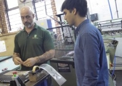
“I recommended that the printing of the logo on business cards and compliments slips should be handled by Baddeley Brothers, as I knew that Claire and Stu would be drawn to its long history in the area, and I also knew them to be fantastic printers and finishers. As I had hoped, the foiling is wonderfully crisp but the character and the imperfections of the original type forms are still there – so I couldn’t be happier with them!”
Director of East London Brewing Company Claire Ashbridge-Thomlinson added: “We have always been seen as a solid, quality and reliable brand and that is something we wanted to hold onto – so collaborating with an authentic, high quality East London printer was the natural choice for our brand. We are all about supporting our local economy and celebrating all that this area stands for.”
She goes on to say that “Now Baddeley Brothers is part of our story too, helping us deliver the contemporary taste and texture of East London to the world, using traditional industrial craftsmanship.East London through and through, Baddeley Brothers has done the most beautiful job on our business cards and the foiling is simply gorgeous.”
Increased collaboration and continual innovation
Baddeley Brothers Director Chris Pertwee said: “Claire was looking for a high-quality grey stock that captured the industrial heritage of the brand.
We recommended Colorplan pale grey 135 gsm for the compliments slips, with foil blocking in gloss black.
We then used duplexing to create the perfect finish and weight for the business cards, using two layers of Colorplan pale grey 175 gsm, again with gloss black foil on both the face and reverse of each card.”
And the collaboration will not be ending there as Claire has plans to use Baddeley Brothers’ other printing skills to add an exclusive feel to some of the exciting new products planned for 2020!
Visit East London Brewing Company, Clare Skeats or Baddeley Brothers for more information